

Table of Contents
- What Was the Two-Fold Objective of Health Canada’s “High In” Front-of-Package Nutrition Warning Symbol?
- Getting It Right: Understanding Reference Amount Versus Serving Size, Threshold and Selecting the Right FOP Icon
- Case 1 – The Goat Cheese Discrepancy (Why Some Get a “High Saturated Fat” Symbol and Others Don’t)
- Case 2 – A 40 g Cookie With 11% DV Saturated Fat (Why It Gets a “High in Saturated Fat” Symbol)
- Case 3 – Vegetable Butter, Ghee, Margarine, and Other Substitutes for Butter – A Free-Pass (Why These “Almost Pure Fat” Products Don’t Get the “High in Saturated Fat” Symbol)
- Principal Display Surface (PDS) versus Principal Display Panel (PDP) – How is the Front-of-Package Symbol Size Calculated
- The Bottom Line – The Complexity of Implementing Front-of-Package (FOP) Symbols on Canadian Food Labels
- Questions & Answers (Q&A) on Front-of-Package (FOP) Labelling
What Was the Two-Fold Objective of Health Canada’s “High In” Front-of-Package Nutrition Warning Symbol?
The goals were noble.
The first goal was to provide consumers with food labels carrying clear, front-of-package visual cues that allowed them to quickly identify and avoid foods high in sodium, sugars, and saturated fat.
The second goal was to incentivize food manufacturers to reformulate their products and lower the levels of these targeted nutrients to completely avoid being flagged by the mandatory warning symbol on their packaging.
Unfortunately it seems that compliance is no longer just about nutrition.
What began as a straightforward consumer-awareness initiative has evolved into an incredibly intricate maze of geometric formulas and unique technical exemptions. When a 40 g cookie with a reasonable amount of fat triggers a warning icon that a tub of high-fat margarine completely bypasses, or when determining a FOP icon’s size requires analyzing the total physical surface area of a glass jar, it becomes clear that designing a compliant Canadian food label is a serious technical challenge.
Below, we break down three real-world case studies where the rules lead to highly unexpected situations, and look at the hidden geometric puzzle keeping food labelling consultants awake at night.
If you live in Canada, you’ve certainly noticed these black-and-white magnifying glass icons on the front of food labels, alerting you to products that are “high in saturated fat”, “high in sugar” and “high in sodium”.
In January 2026, they became mandatory for most of the products with high levels of those nutrients.
Note: At the end of 2025, we wrote an article summarizing the requirements: Urgent – New Canadian Front-of-Package Food Labeling Regulations
At first glance the implementation of such regulation seems straightforward.
You would think it’s as simple as: “look at the NFT (nutritional fact table) and for a product with a serving size of 30 g or 30 ml or less, add the icon if any of those three nutrients hit 10% or more of the daily value (DV)”. ; Consider 15% DV if the serving size is greater than 30 g/ml, or 30% DV for a prepackaged meal.”
WRONG. That would have been too easy.
(We’ll see later in this post the correct way of defining such a requirement).
You would also think sizing the icon would be simple.
The CFIA regulations already clearly defined the Principal Display Panel (PDP), which dictates where mandatory information goes and sets the font size for net quantity. It should be as simple as matching the icon size to the PDP area.
The regulations could have simply stated: “for a PDP size between 100 cm2 and 250 cm2, use the bilingual horizontal icon 4.5 BH if it fits, and the vertical one if the horizontal icon doesn’t fit the width”. Icon 4.5 BH already has a size, a font size, etc., simply insert it on your artwork.”
WRONG AGAIN. That would have been too easy.
Instead the regulations introduced an entirely separate concept called Principal Display Surface (PDS), which is sometimes the same as the PDP, and sometimes completely different.
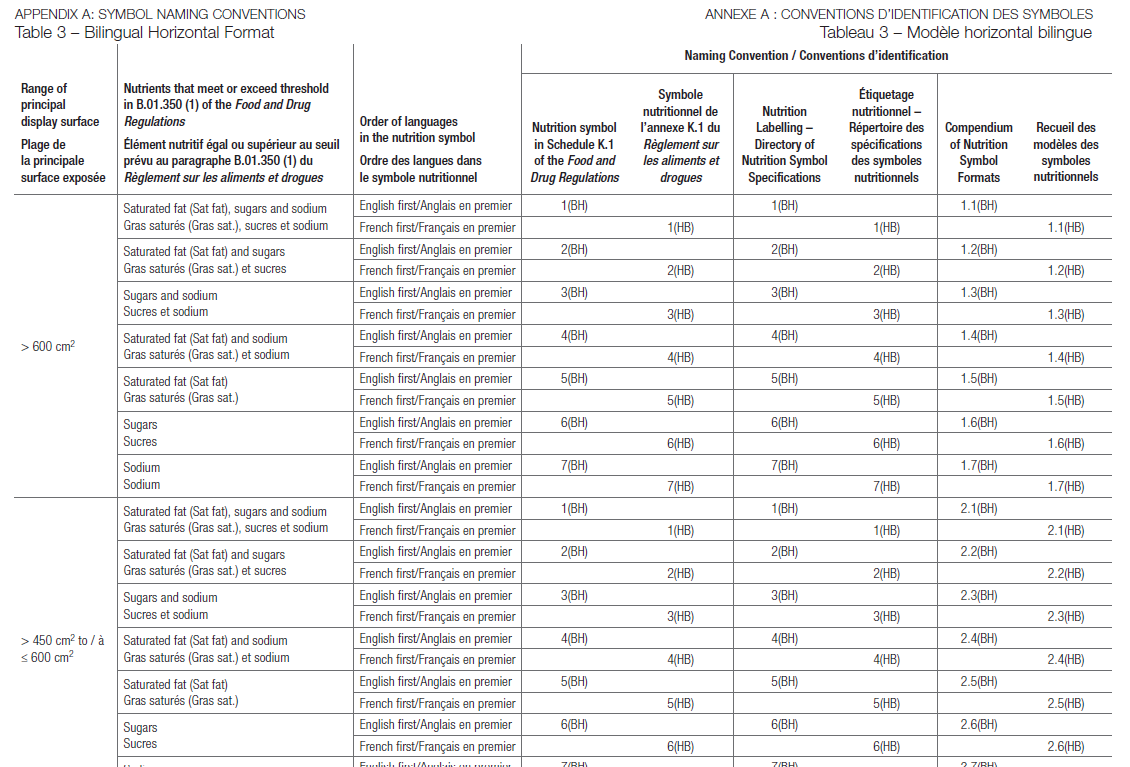
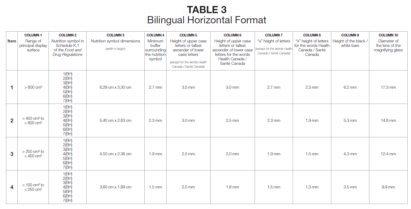
Navigating the sizing tables provided to the industry is enough to make your head spin.
These are some examples: (I am not kidding you!):
STRUGGLING WITH CANADIAN FOOD LABELING COMPLIANCE?
Whether it’s ingredient standards of identity, front-of-package symbol, bilingual labelling, or nutrition facts, we’re here to help you navigate the process with confidence.
A quick call is the first step toward compliance success!
Getting It Right: Understanding Reference Amount Versus Serving Size, Threshold and Selecting the Right FOP Icon
For those who want to dig into the details, I am discussing understanding reference amount versus serving size, and threshold and selecting the right FOP icon in Case 2 – The 40 g Cookie With 11% DV Saturated Fat. I’ll also discuss the difference between Principal Display Panel (PDP) and Principal Display Surface (PDS) at the end of this article.
But even more alarming is the fact that this regulatory complexity creates real-world cases that are, frankly, simply unfair – in my opinion!
Case 1 – The Goat Cheese Discrepancy (Why Some Get a “High Saturated Fat” Symbol and Others Don’t)
A true story.
I was in a supermarket recently and compared two goat cheeses. Product A carried “high in saturated fats” FOP icon; Product B did not. Yet, looking at their Nutrition Facts Table (NFT) they shared the exact same serving size and the exact same amount of saturated fat.
Was it a manufacturer mistake?
Actually not. Product B was legally exempt from displaying the FOP icon because it contained 5% or more DV calcium per serving size (or reference amount, whichever is greater). The regulators did not want the FOP to scare consumers away from dairy products, since calcium intake is a public health priority.
Oh wait! There is a bureaucratic twist here. If you read the text of the Food and Drug Regulations (FDR), the exemption threshold is set at 10% DV calcium (see below an excerpt of the official Gazette web page, from May 2024).
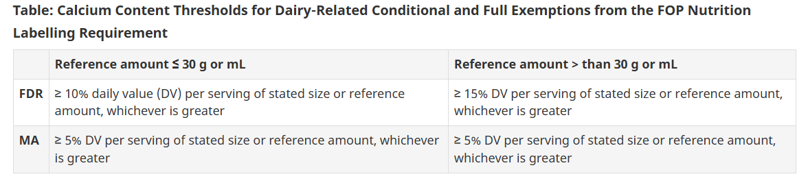
Yet, I mentioned 5%.
Are you still following me, LOL?
May 2024 – Health Canada Introducing a Marketing Authorization (MA)*
Because a massive portion of nutritious dairy products naturally hover between 5% and 9% DV of calcium per portion, Health Canada used an MA* to quickly slash the exemption threshold to 5% DV before the implementation deadline, sparing a huge segment of the dairy industry from negative warning labels.
*What is an MA? A Marketing Authorization (MA) acts as an expedited legal override issued by the Minister of Health, permitting immediate exceptions to the strict text of the Food and Drug Regulations without waiting for a multi-year formal amendment process.
Case 2 – A 40 g Cookie With 11% DV Saturated Fat (Why It Gets a “High in Saturated Fat” Symbol)
Another true story.
Check this cookie weighing 40 g that contains 11% DV of saturated fat. You might think: “The cookie is over 30 g, so the 15% DV threshold applies. Since 11% is less than 15%, it doesn’t need a FOP icon.”
WRONG AGAIN. But why?
Because the regulations dictate that the threshold selection (10% vs. 15% DV) is strictly dictated by the food’s regulated Reference Amount, which for cookies is 30 g. The strict 10% threshold is locked in.
However, the actual calculation of the % DV must be based on the reference amount or the actual serving size, whichever is greater. So here you go, the serving size (one cookie) is 40 g. The result? The cookie has 11% DV saturated fat, crosses the locked-in 10% threshold, and must carry a “High in Saturated Fat” warning.
Meanwhile, a different food product with a regulated reference amount of 40 g containing the exact same 11% DV of saturated fat escapes the icon entirely. It seems to me quite an unfair playing field. Would you say?
As a reference, here is the official text in the Guidance documentation:
The 10% DV threshold always applies to a product with a small reference amount (more specifically, ≤ 30 g or 30 mL), even when the serving size is larger than 30 g or 30 mL and must be used as the basis when assessing the amount of saturated fat, sugars and/or sodium to determine if a symbol is required. For example, consider dried meat, such as beef jerky, with a reference amount of 30 g and a serving size of 45 g. Given that the reference amount is 30 g, the applicable threshold is 10% DV. Given that the serving size of 45 g is greater than the reference amount, it must be used as the basis when assessing the amount of saturated fat, sugars and/or sodium against the 10% DV threshold.
Case 3 – Vegetable Butter, Ghee, Margarine, and Other Substitutes for Butter – A Free-Pass (Why These “Almost Pure Fat” Products Don’t Get the “High in Saturated Fat” Symbol)
Third true story.
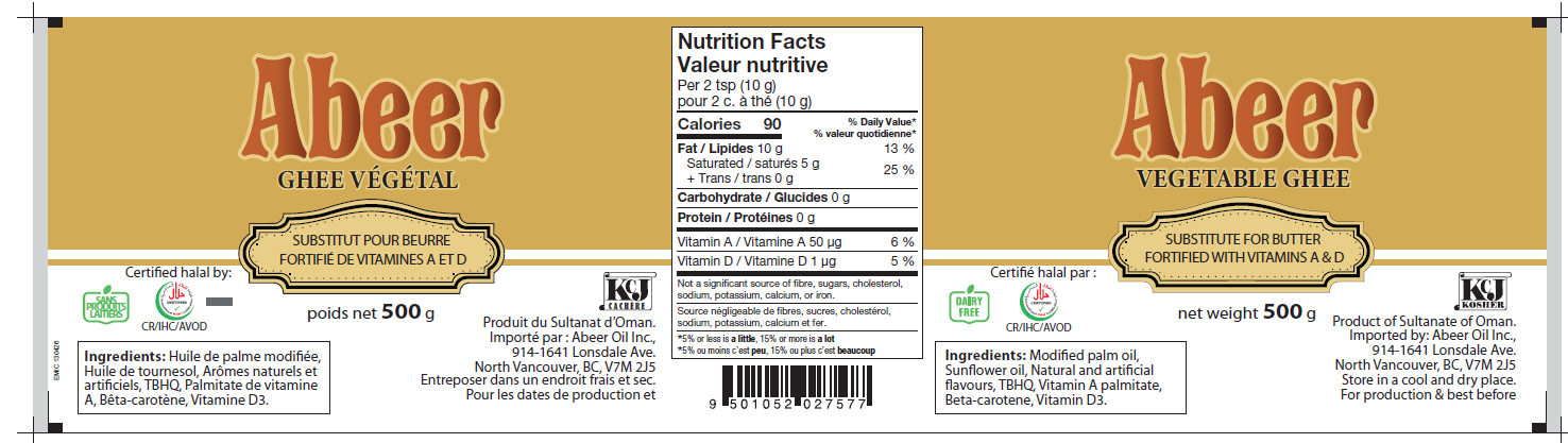
See the label below: a 10 g serving size packed with 25% DV of saturated fat, yet completely devoid of an FOP icon.
Is that right? Does it make sense?
Do consumers assume that because it’s plant-based and lacks a warning label, it must be healthy? Absolutely. Yet, the label is legally correct.
The rationale? Health Canada grants these products a “practical exemption” “on the basis of redundancy”. The logic is that consumers already know a brick of butter or ghee is inherently high in fat, so a warning symbol would state the obvious and add no educational value.
Crazy, no?
To keep the market fair, Health Canada then explicitly extended this exemption to margarine and other direct substitutes for butter to maintain a level playing field in the marketplace.
The justification of who displays a Front-of-Package (FOP) icon and who gets a pass leaves me quite perplexed.
 So, this article highlighted a few elements of complexities of the FOP regulations and some real-world case studies where the rules seem to lead to odd or unfair situations.
Let’s quickly wrap it up with an explanation of PDP versus PDS.
Principal Display Surface (PDS) versus Principal Display Panel (PDP) – How is the Front-of-Package Symbol Size Calculated
To close out, let’s look at the geometric puzzle that dictates the actual size of the FOP icon.
As mentioned earlier, the CFIA regulations use the concept of Principal Display Panel (PDP), to dictate where mandatory information goes and what the font size must be for net quantity. However, the FOP regulations look at the Principal Display Surface (PDS).
While the two values are the same in the case of a box, they are completely different for packages such as cans, bottles and jars. Crucially, whether or not you can physically place a label on a jar surface that isn’t flat is simply not taken into account.
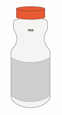 While the PDP is simply the main part of the label (like the front of a box or the front 40% of a jar)—defined as “the part of the label that is applied to all or part of the principal display surface”—the PDS is much broader.
The regulations define the PDS as follows: “If the package has a surface that is displayed or visible under customary conditions of sale or use, [the Principal Display Surface (PDS) is] the total area of that surface, excluding any surface that is the top of the package”.
For that reason, diagrams of cylindrical packages (jars, cans or bottles) show the PDS hatched across the total height and width of the container; the PDP being the visible label area.
Now… calculate the size of the PDS and check the table to determine the size of the FOP symbol.
Because you are required to calculate the size of your FOP icon based on the total PDS area, rather than the smaller PDP label area, if your label is much smaller than your container, you now have an oversized FOP symbol on your principal panel.
Such is life.
The Bottom Line – The Complexity of Implementing Front-of-Package (FOP) Symbols on Canadian Food Labels
What began as a straightforward consumer-awareness initiative has evolved into an incredibly intricate maze of geometric formulas and unique technical exemptions. When a 40 g cookie triggers a warning label that a tub of margarine bypasses, or when determining an icon’s size requires analyzing the total physical surface area of a glass jar, it becomes clear that compliance is no longer just about nutrition. For Canadian food manufacturers and consultants alike, navigating these guidelines (summarized in a 92-page document!) requires a deep appreciation for the technical nuances hidden within the framework. Until these complex layers become second nature to the industry, achieving perfect compliance will remain quite tedious.
STRUGGLING WITH CANADIAN FOOD LABELING COMPLIANCE?
Whether it’s ingredient standards of identity, front-of-package symbol, bilingual labelling, or nutrition facts, we’re here to help you navigate the process with confidence.
A quick call is the first step toward compliance success!
Questions & Answers (Q&A) on Front-of-Package (FOP) Labelling
The primary purpose of the front-of-package symbol is to alert consumers to hidden or unexpected levels of saturated fat, sugar, and sodium in processed, multi-ingredient foods (like a frozen pizza or a granola bar). Because butter, margarine, table salt, and white sugar are single-ingredient commodities that are fundamentally made of those exact nutrients, Health Canada determined that a warning label on them would be completely redundant. Essentially, consumers already know butter is virtually 100% fat, so a giant warning symbol on the front provides no new or useful information at the grocery shelf.
Under Health Canada’s updated regulations, a dairy cheese is exempt from the front-of-package symbol if it contains 5% or more of the Daily Value (DV) for calcium per serving of stated size or per reference amount, whichever is greater. This rule creates a clear division: traditional, calcium-rich cheeses easily bypass the warning because they preserve this critical shortfall nutrient, while highly processed or low-calcium cheeses fail to meet the threshold and must display the warning label.
The quantity of food used to calculate the threshold for FOP is the regulated reference amount. Then, the calculation of the %DV is based on either the serving size or the reference amount for the product, whichever quantity is greater.
Based on that quantity, a general threshold rule requires a front-of-package symbol if a food contains 15% or more of the Daily Value (DV) for saturated fat, sugars, or sodium. For prepackaged meals and main dishes, this threshold increases to 30% DV, while foods with a small reference amount of less than 30 grams trigger the warning at 10% DV.
Under Health Canada regulations, the reference amount is a fixed, legally mandated baseline that represents the quantity of a specific food type an individual typically eats in a single sitting. In contrast, the serving size is the actual portion listed at the top of the product’s Nutrition Facts table, which the manufacturer must strictly calculate using household units to align as closely as legally possible with that regulated reference amount.
A Marketing Authorization (MA) acts as an expedited legal override issued by the Minister of Health, permitting immediate exceptions to the strict text of the Food and Drug Regulations without waiting for a multi-year formal amendment process.
Further Reading:
- Urgent – New Canadian Front-of-Package Food Labeling Regulations
- Food Labels: Differences Between U.S. & Canada – Nutrition Facts Table, Ingredients, and More – 2025 Updates